Top 10 Tips to Increase Your Website Conversion Rate
If you haven’t done this before, it can be a daunting task. You have to think about setting up tests, monitor them until they have statistical significance, and account for variables.
To make this process a little easier, we are going to give you 10 tips to get started:
Create your landing page
Think about who is going to click on your landing page, why are they there? Tailor the page to fit them.
It’s important to think about what you are going to say too. People coming to your page are likely going to have a lot of questions, and a single landing page can’t answer all of them, so don’t try. Only give out keys bits of information and keep your message clear.
Keywords
The best way to increase conversions is to target high-intent keywords that demonstrate a strong interest in buying. While these keywords might be more expensive, they will pay off in the end. Just make sure you find the right balance between increasing conversions and getting a good return on your ad spend.
Dynamic Campaigns
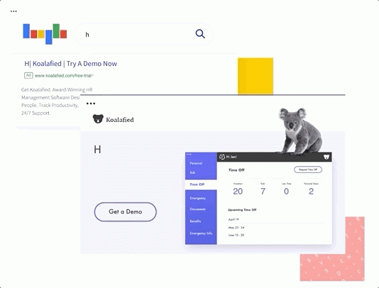
This one is easy, Google has a feature called ‘dynamic keyword insertion’ that will automatically match your text to your ad’s search terms. They also have ‘Dynamic Text Replacement’; this is an unbound feature that automatically matches the content of your landing pages to the search terms used by users.
Dynamic Campaigns
Five Seconds Test
A great way to get feedback about your web page is to show a user your page for 5 seconds and then ask them questions about it. If they know what your key message is, you succeeded - if not, it might be time to go back and think about about your key messages.
Cognitive biases = Increase Incentive
For decades, cognitive bias has been used by marketers to influence buying decisions.
Here are some common biases:
Loss aversion: We fear loss more than we celebrate gain of the same value.
Anchoring bias: Placing more weight on the first piece of information.
The mere exposure effect: The more we see something, the more we associate with it.
Sunk cost bias: The desire to continue something we’ve already invested time or money into.
The halo effect: Why our first impressions influence our ongoing perception of things.
The serial position effect: The first and last pieces of information we receive are more memorable.
For example, you can use loss aversion to create a sense of scarcity and the fear of missing out. Or you can ‘give’ users something of no genuine value (eg: a temporary discount) and trigger the instinctive fear of losing it.
Cognitive Bias
Reduce Options
People get fatigued quickly, so don’t give users too many options. The less options you have, the more likely they are to convert.
Make sure that there is only one CTA in view at a time and try removing the header for navigation on your landing page. This is will drastically reduce decision fatigue with users.
Give Something Away
Users are savvier than ever and will instinctively compare the rewards to investment. This is why doing free giveaways can be so effective. Free coupons and content downloads are popular lead generation straggles, but its key to show the perceived value of your giveaway. You can use Hubspot (its free) to lure people into using software and then to paid products.
Think About Loading Times
Loading Times
Reducing loading times can have a dramatic change in how many conversions you get. Use Google’s free Page Speed Insights tool to identify speed killers and reduce your loading times.
Add a CTA to the Bottom of Every Page
If users are browsing your site and don’t buy into your primary conversion goal, don’t let them slick back to search without a fight. Create a less demanding action like ‘signing up’ to your newsletter OR maybe offer that free giveaway as a tool to capture leads.
Choose your CTA
Optimise your CTA’s
It’s your CTAs that give people the final push they need to convert. Make sure you optimise your call to action and test that they are working hard enough, if they don’t all your hard work will have been for nothing.


