Web Design Predictions for 2017
It’s that time of the year where we look at the year that was and the year that will be. As an evolving industry, changes in the web design field are almost inevitable in any part. We have now hit 2017 and everyone is looking forward to many trends and shifts that may occur or are already looming in the field of web design.
At UNBXD, the team has all come together and predicted their own web design predictions for 2017, which we have collated in this blog post. We have chosen the trends that we believe will significantly shape the world of web design in 2017. From themes to technologies, we expect that these trends will influence both the performance of websites and ultimately, the experience of the users in the years to come.
Credit: Spotify
1-Duotone Gradient Imagery
A duotone is a half-tone reproduction of an image using the superimposition of one contrasting colour halftone over another colour halftone. Duotones are utilised to find a balance between a minimal and a busy or distracting website.
In the past, many brands and designers have typically stuck with web-safe colours (that are usually just one bold colour alone), however, more brands today are being braver in their approach to using colour. Towards the end of 2016, we saw the likes of Spotify begin to apply the duotone gradient to their website towards, which indicated that it may be a new trend for 2017. Instead of a flat tone colour, it is much more visually appealing to have a duotone gradient.
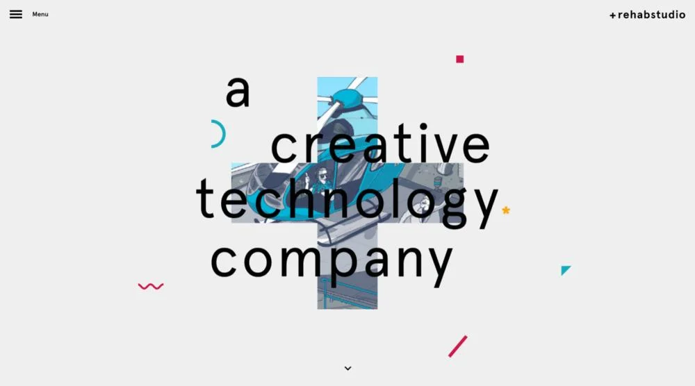
Credit: Rehab Studio
2- Imaginative Heading Styles
Although in 2016, many websites were moving away from using the basic heading style on websites (sans serif, all capitals, centred heading) and moving more toward imaginative or creative heading styles. By changing up your heading style, it welcomes creativity and makes you distinctive and different within the market.
The ways in which designers are changing up their heading styles on a website is by redesigning the justification and layout of the heading, adding unique elements to the heading or even going without a heading (and instead using imagery). It is clear that web designers have been experimenting with their header designs and we believe these changes will rise throughout 2017.
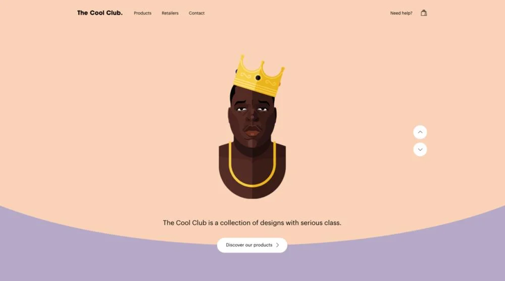
Credit: Cool Club
3- Increased Use of Animations and GIFs
The use of animations on websites is increasing and this is often because they are a great way of showing how something works, being informative or otherwise reveal meaningful content. GIFs have also been used for this purpose; however, we are now seeing GIFs becoming more sophisticated and animations using SVG and CSS to achieve some pretty unique design elements.
Here at UNBXD, we predict that the use of animations is going to become much more prevalent in 2017. This is because more content types are being shared and animation can communicate things more straightforwardly and quickly than text and video can. Plus, when done right, animation and GIFs adds a lot more to the user experience than just imagery.
Credit: Vice
4- Emphasis on Content
Over the years, web designers have been filling websites up with things such as sidebars, headers, banner ads, sidebar ads, call to action, comments, popups, social media buttons, signup boxes, etc. All of these things, however, have ended up becoming cluttering and taking the attention away from the entire point of a web page: the content.
We see 2017 being the year where websites are more likely to start moving back to basics and minimalistic design, where there is more of an emphasis on content. Stripping back all the plugins and add ons and focusing primarily on the content is essential to moving forward with your website in 2017.
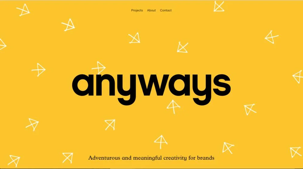
Credit: Anyways
5- Increased use of hand drawn elements
A trend that we believe is going to come even more into force within in 2017 is the increased use of hand drawn elements on web design. These elements include fonts, icon, graphics, buttons and other elements that bring a distinctive touch to websites, and even branding.
In the past, many would not associate drawing with websites, but the introduction and the rise of popularity in using hand drawn elements has been a nice change to standard design components.
Credit: UNBXD
6- Landing Page over Home Page
The more we refine content and look to share and market it in many different ways, 2017 will likely see the rise in landing pages instead of home page designs. Although every website does require a home page, as content marketing continues to rise and becomes more contagious, marketers will want to direct traffic to dedicated landing pages to better target their visitors needs.
Landing pages have the capability of being targeted specifically to your visitor’s requirements, which makes a lot more sense. Content marketing is to increase awareness and conversions, and there is no better way than to have visitors land on a page that is catered totally for them. In other words, landing pages allows you to make a success of a user’s experience and that will more than likely encourage them to return again.
2017 is definitely going to be the year where we see great websites created, and these design trends will definitely be some of the best website designs yet to come.
If you are looking to change your website in 2017 and would like to have one of these trends implemented on it, then feel free to contact us here at UNBXD. Our goal is to showcase your company in its best light through our web designs.


