Top 5 Web Design Trends Of 2016
So far this year there has been a surge in the popularity of responsive web design, as more and more sites join the drive to become 'mobile ready'.
Web usage patterns are changing and statistics cannot be ignored if you want to succeed in today's market. Every third website visitor now uses a mobile device and website that don't offer mobile optimised versions are causing an unpleasant experience and eventually loses money as users tend to abandon the website if it doesn't render well on mobile devices.
This brings us to our first trend of 2016...
1. Mobile First Websites
Adopting a mobile first approach when designing or redesigning your website will ensure that you maximise your potential and reach more of your target audience.This means you need to be concise, and focused on content and performance which will take advantage of advanced features, like GPS, touch screen (including swiping), and mobility, that desktops aren't able to offer. Throughout 2016 , we'll be seeing the continuous growth of mobile web design and innovations on the ever changing market behaviour.
Examples of Mobile First Web Design - Typeform
Typeform is a Barcelona-based tech company with one, simple mission: to "make forms awesome." Their desktop website is really beautifully designed, greeting visitors with succinct copy, high-definition videos, relevant animations, and other, more complex design components.
But for mobile users, they recognised that complex design components like video and animations could significantly affect page load time, among other difficulties. That's why they actually removed many of them -- which decluttered the site and simplified the overall mobile experience. The mobile website is a simpler version of their desktop website, and it's still beautifully designed.
Take note of the large buttons in their menus - perfect for tapping with your finger on a mobile screen.
2. Personal Branding
This is something I have adopted myself recently, designing a personal portfolio for my work but also creating a chance to tell my audience a bit about how I work, who I've worked with, and a bit about myself without having a specific tie to a company. Personal branding exists whether you focus on it or not. Your identity and your image (how you are perceived by other people) are very different. The main focus of personal branding is to align vision and mission so you are perceived as you’d like to be instead of people speculating and having different opinions about you.
Examples of Personal Branding Web Design - An1ken Group
Founder of An1ken, Jacques van Heerden makes sure people get to know him, his company values and what his company is all about.
Examples of Personal Branding Web Design - Tobias Van Schneider
Bold, straightforward and effective. Tobias uses lots of negative space to draw attention to his personal brand and make communication clear with concise facts.
3. Responsive Design
Responsive web design (RWD) is an approach to web design aimed at crafting sites to provide an optimal viewing and interaction experience—easy reading and navigation with a minimum of resizing, panning, and scrolling—across a wide range of devices (from desktop computer monitors to mobile phones).
It’s safe to say responsive design isn’t going anywhere soon, as it represents a relatively simple and cheap way for businesses to build a fully-functional mobile-friendly site. Responsive web design is also highly compatible with minimalism, thanks to the necessity to keep page weight down.
Examples of Personal Branding Web Design - Founder Mantras Examples of Personal Branding Web Design - Swiss Air Examples of Personal Branding Web Design - Rally Interactive
4. Animations
Animations are becoming an increasingly popular way of making a websites experience more interactive and entertaining. Generally animations can be thought of in terms of two groups:
Large scale animations. These are used as a primary interaction tool have more impact on users and include effects like parallax scrolling and pop-up notifications.
Small scale animations. These include spinners, hover tools and loading bars, and don’t require any user input.
Here are 3 of the most popular animation techniques:
Loading Animations
Loading animations can be a great way to entertain user during an otherwise tedious experience.
Hover Animations
Hover animations can give the site a more fluid and interactive feel. Users unsure about a feature's function on a website tend to hover over them automatically for instant visual feedback.
Galleries & Slideshows
Galleries and slideshows are an effective way to showcase multiple images without overwhelming the viewers. They're great for E-Commerce sites to showcase new products, and also portfolio sites that need to show a range of projects.
5. Flat Design
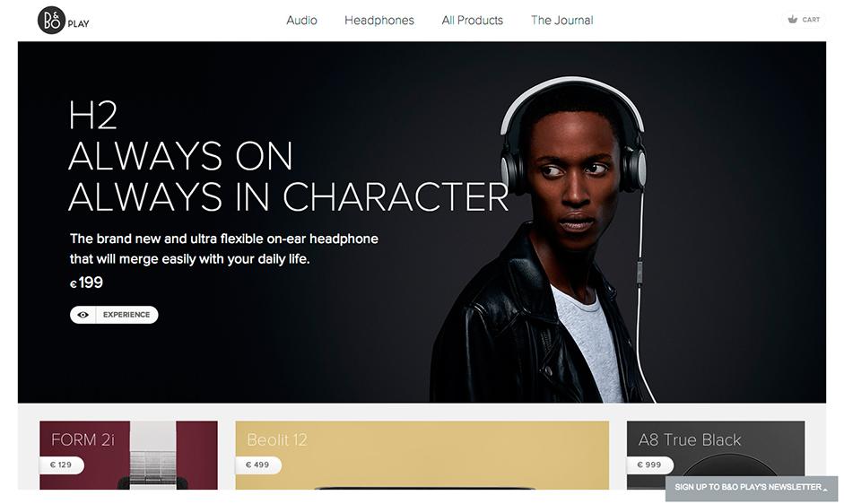
Flat Design or also know as Modular Design has been around for a while and we don't think it will be going away anytime soon. This is because of it's compatibility with others web designs trends such as Minimalism and Responsive Design.
Examples of Flat Web Design - B&O Play
Final Notes
Trends are trends for a reason, meaning that they come and go. Don't just follow them just because they are the 'in' thing to do at the moment. Do take note of them because they represent a popular techniques for a reason, just always make sure that is the best and most suitable choice for your site.
Thanks for reading!


