7 Types of Logos to Consider for Your Brand (With Examples)
Creating the perfect logo isn’t easy, but the rewards are endless. There’s so many ingredients you’ll think you’re making a gluten free cake: how are you meant to balance them all?
Incorporating your brand identity into your logo, as well as conveying your message and designing something which actually looks good can be very challenging, especially if you’re not sure what you want. Check out our blog on common logo design mistakes for some tips before you begin.
Once you know what to avoid, start considering the type of logo you’re looking for, because there isn’t just one: in this blog, we’ll show you seven!
Logo Symbols or Pictorial Marks
Pictorial marks are simple and recognisable images used in logos to represent a brand. They don't use text: just a graphic or symbol often representing a real object, like apples or shells. Pictorial marks are great because they transcend language, working well across different cultures and spreading the message of global brands.
However, new companies may face challenges with brand recognition and association, which is why pictorial marks are often accompanied with the company name in a combination mark. A lot of brands known for having iconic logo symbols, such as Domino’s, started off as combination marks with their brand name always included alongside, above or beneath their pictorial mark. The logos were then reworked and simplified once they’d established strong brand recognition.
Brands with iconic logo symbols:
Mascots
Mascot logos are fun and friendly characters used by brands to represent themselves. They act as brand ambassadors, bringing personality and a human-like touch to the company's image. They’re often colourful, cute, or bold, making them memorable and relatable to customers, plus reflecting the brand’s values and identity.
Mascots are particularly popular with food brands plus brands which tend to target families and children. They create a fun, playful vibe and build a relationship with your audience.
Abstract logos
Abstract logos use unique, creative shapes and designs to represent a brand. Unlike pictorial marks with recognisable images, abstract logos don't show specific objects or things. Instead, they use artistic and imaginative elements to convey a brand's identity and values.
These logos are all about creativity and making a memorable impression. They allow companies to stand out with visually striking and versatile designs that capture attention and spark curiosity.
Abstract logo marks often require a bit of thinking, as they may not immediately reveal what the company does. However, they can become powerful symbols associated with a brand over time, creating a strong visual identity that helps the company become easily recognizable.
Monograms or lettermarks
Monogram logos combine two or more letters or characters from a brand's name to create a unique and stylized symbol. The letters are often intertwined or otherwise arranged in an artistic and interesting way: monogram logos are all about simplicity and elegance, making them perfect for brands that want a sophisticated and memorable identity.
Monogram logos are versatile and can be used as a standalone symbol or alongside the full company name.
Wordmarks or logotypes
Wordmarks are logos that use stylish and creative typography to represent a brand. Instead of relying on symbols or images, they focus on the company's name itself, turning it into a distinctive and visually appealing design.
These logos play with different fonts, colours, and arrangements to make the company's name stand out and leave a lasting impression. They can be elegant, modern, playful, or bold, depending on the brand's personality and target audience.
Logotype designs are great for companies that want to emphasise their name and create a strong association between their brand and the text. They are versatile and work well across various platforms, from business cards to websites.
Combination logos
Combination logos cleverly combine both text and visual elements to represent a brand. They blend the best of both worlds by incorporating a symbol or icon along with the company's name or initials. These logos are perfect for companies that want a strong visual identity while ensuring their name is associated with the brand. They strike a balance between creativity and clarity, making them a popular choice in the world of branding.
Combination logos offer flexibility: the symbol can be used on its own when brand recognition is strong, and the full logo including the text can be used when introducing the brand to new audiences.
For example, think of the famous McDonald's logo: the iconic golden arches (symbol) are combined with the brand name written in a distinctive font (text), creating a recognisable and impactful combination logo.
Emblems
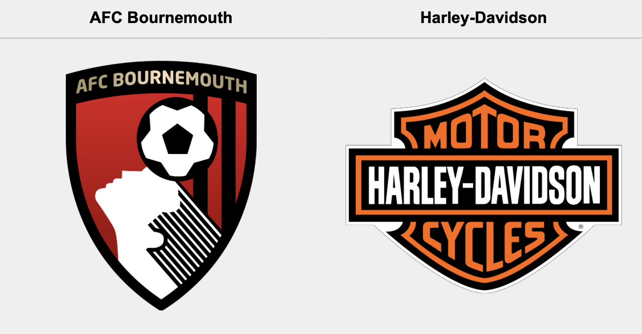
Emblem logos are another type of combination logo, combining text and symbols within a unified shape or container. They often have a classic and traditional look, resembling badges or seals, which gives them a sense of authority and reliability. These logos typically place the brand name or initials inside the central graphic, creating a strong connection between the two elements. The design is self-contained, with text and symbols working together harmoniously. Emblems are often used by universities, football clubs and car brands.
While emblem logos look great and convey a sense of authority, they can be less versatile compared to other logo types as intricate details may not work well in small sizes or on certain digital platforms.
DO YOU NEED HELP CREATING THE PERFECT LOGO FOR YOUR BRAND?
At UNBXD, we have a team of design experts on hand to create recognisable, distinctive logos in line with your brand’s identity. Our brand identity services also include brand naming, brand guideline design, brochure design, signage design, packaging design and brand consultancy.

